Womanlike
- Package
Hyesoo Ra- autreaile@gmail.com
In our society, women are greatly restricted of activities, because of their sex. This restriction, which originates from physical difference, has even established the basis of the frames that define how women should look like. There are many factors that distinguish female from male. Among them, I find 'menstruation', which most women experience monthly, is the most significant difference.
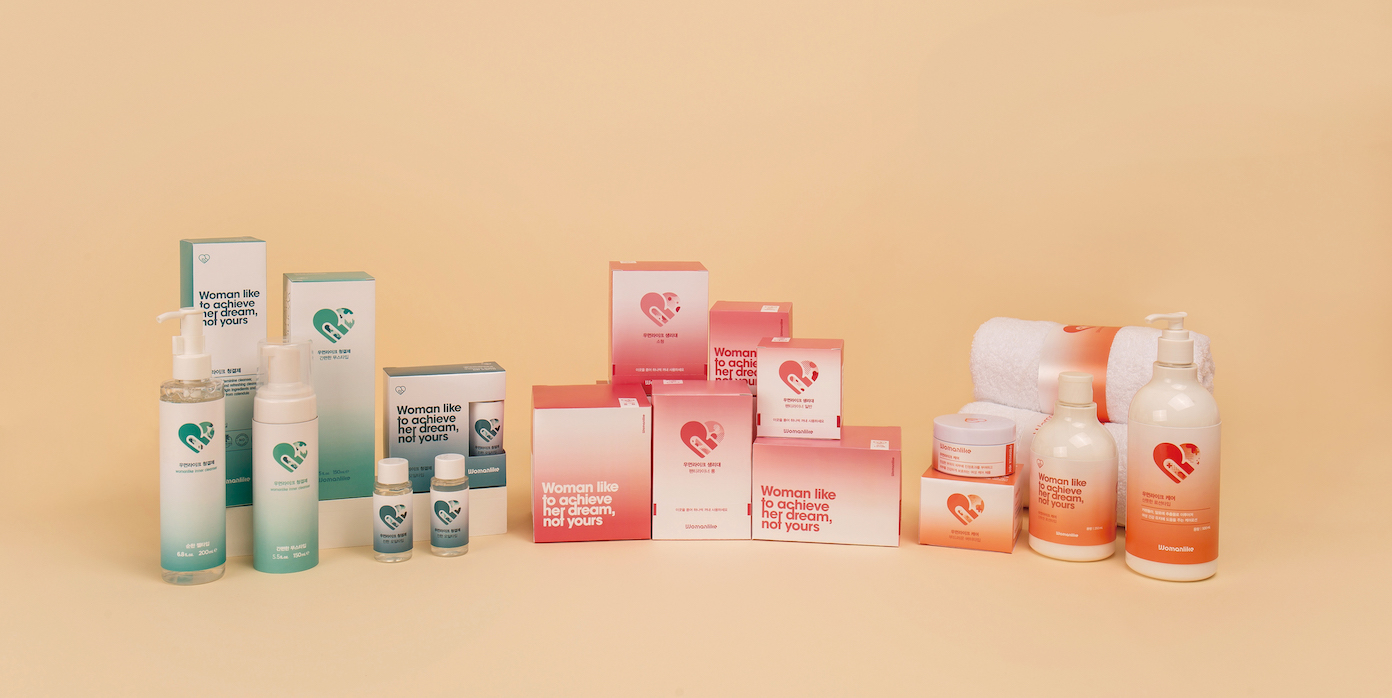
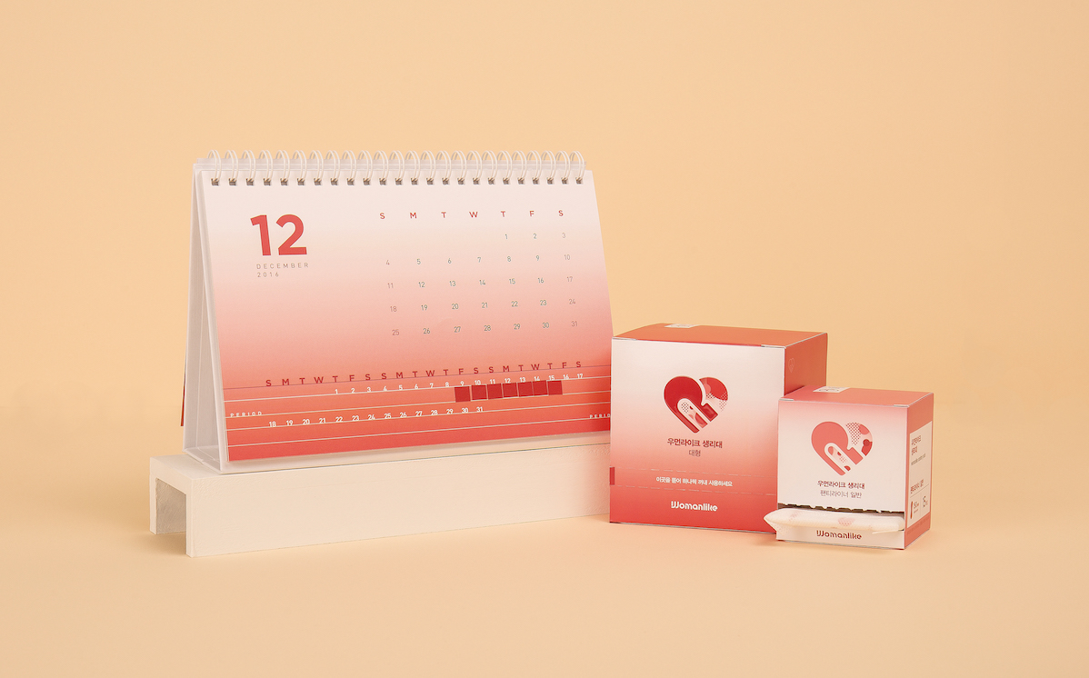
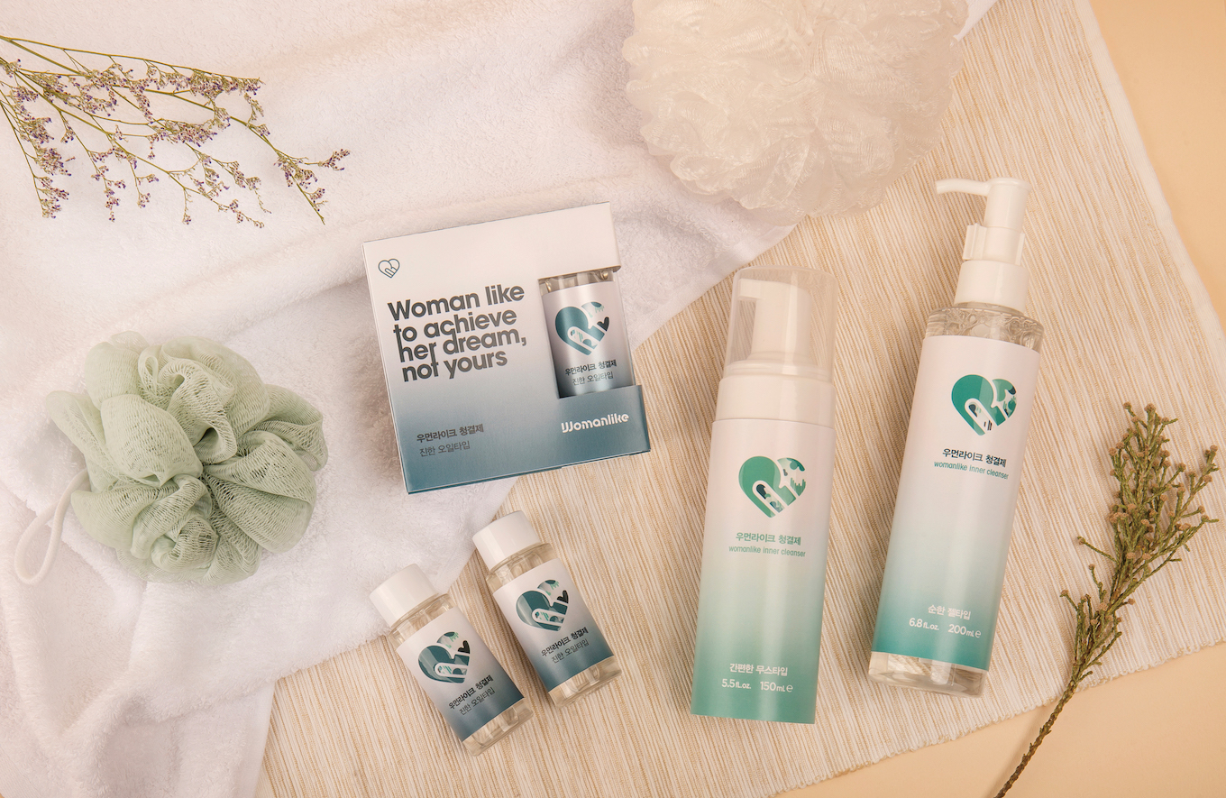
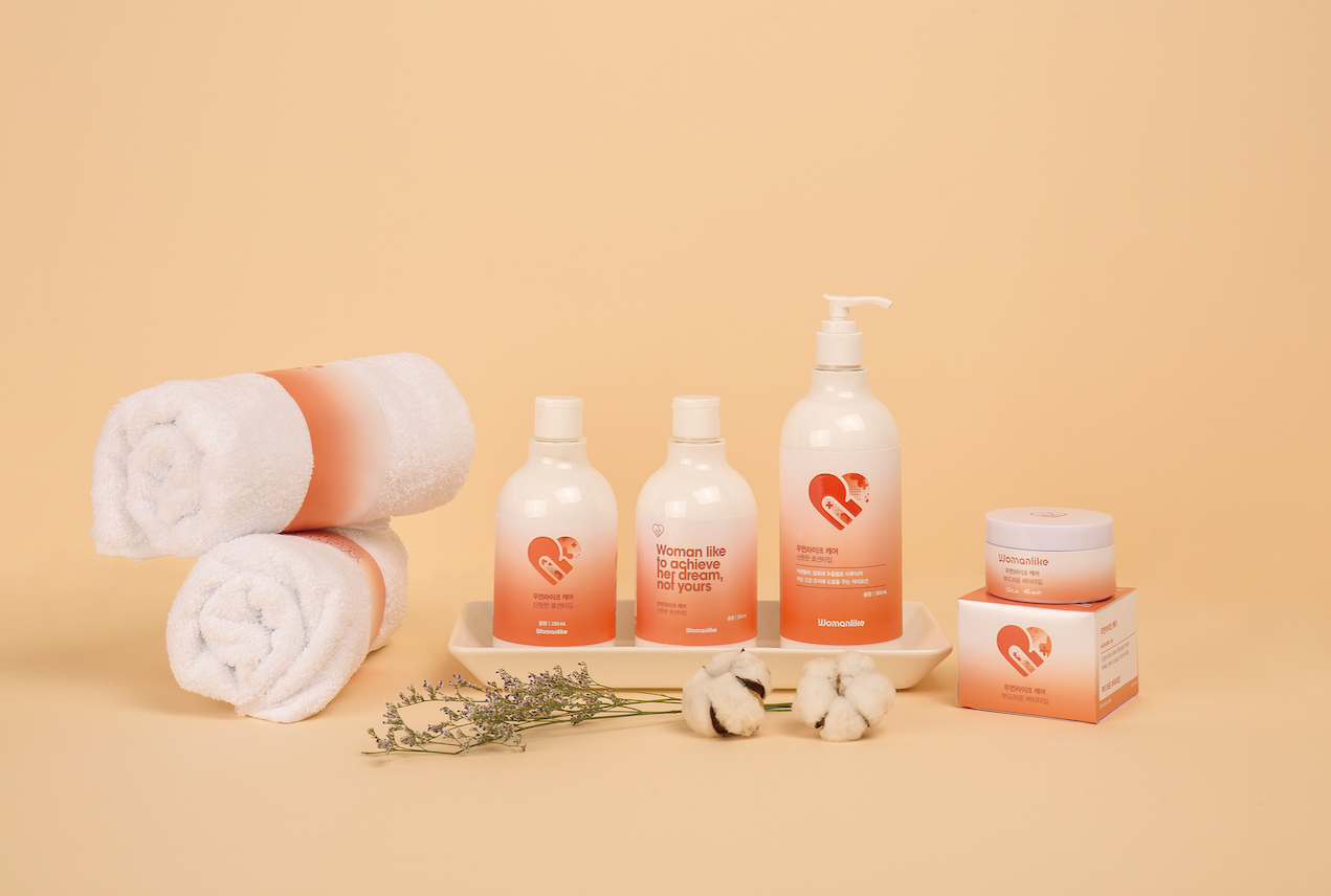
"Womanlike" aims to correct the stereotypes of women, and express their hidden ability through ‘female products' which are created upon their physical difference from men. Womanlike, the name of the brand, is based on the word 'womanlike’ meaning 'feminine’. It redefines the limited meaning of ‘feminine’ by being the first two words of slogan ‘Woman like to achieve her dream, not yours’. The graphical symbol, which changes upon the three major product groups -sanitary pads, feminine hygiene cleanser, and care - intends to break stereotypes and pursues a diverse image of women. "Womanlike" seeks to empower all women in the world who break the barriers of society with this symbol and slogan.
"Womanlike" aims to correct the stereotypes of women, and express their hidden ability through ‘female products' which are created upon their physical difference from men. Womanlike, the name of the brand, is based on the word 'womanlike’ meaning 'feminine’. It redefines the limited meaning of ‘feminine’ by being the first two words of slogan ‘Woman like to achieve her dream, not yours’. The graphical symbol, which changes upon the three major product groups -sanitary pads, feminine hygiene cleanser, and care - intends to break stereotypes and pursues a diverse image of women. "Womanlike" seeks to empower all women in the world who break the barriers of society with this symbol and slogan.
우리 사회에서 여성들은 여성이라는 이유만으로 활동에 여러 제약을 받는다. 신체 차이에서 시작된 제약은 그것에 그치지 않고, 여성들이 어떤 모습으로 있어야 하는지를 규정짓는 프레임의 기초가 되었다. 남성과 여성의 신체적 다름에는 여러 가지가 있지만 여성들이 달마다 겪는 ‘생리’를 그중에서 가장 특징적인 차이라 느꼈다.
우먼라이크는 신체적 차이로 생겨난 ‘여성용품’을 통해 여성을 향한 고정관념을 바로잡고, 가려진 역량을 표현하고자 한다. ‘Womanlike’는 여성스러운을 뜻하는 단어 ‘womanlike’에서 착안한 것으로, 슬로건 ‘Woman like to achieve her dream, not yours’의 앞 두 단어가 되어 ‘여성스러운’의 제한된 뜻을 새롭게 정의하고자 하였다. 생리대, 청결제, 케어 총 세 가지 라인별로 변화하는 그래픽 심벌은 고정관념을 벗어나서 다양한 여성상을 추구하려는 의도를 담았다. 우먼라이크는 이런 심벌과 슬로건으로 사회의 장벽을 깨는 이 세상 모든 여성들을 지지하고자 한다.
우먼라이크는 신체적 차이로 생겨난 ‘여성용품’을 통해 여성을 향한 고정관념을 바로잡고, 가려진 역량을 표현하고자 한다. ‘Womanlike’는 여성스러운을 뜻하는 단어 ‘womanlike’에서 착안한 것으로, 슬로건 ‘Woman like to achieve her dream, not yours’의 앞 두 단어가 되어 ‘여성스러운’의 제한된 뜻을 새롭게 정의하고자 하였다. 생리대, 청결제, 케어 총 세 가지 라인별로 변화하는 그래픽 심벌은 고정관념을 벗어나서 다양한 여성상을 추구하려는 의도를 담았다. 우먼라이크는 이런 심벌과 슬로건으로 사회의 장벽을 깨는 이 세상 모든 여성들을 지지하고자 한다.
All rights reserved © 홍익대학교 디자인학부 시각디자인전공 졸업전시회 2016
version.0.0.1 Jerkyll included. Design by JiHoonLee
version.0.0.1 Jerkyll included. Design by JiHoonLee