Pause
- UX/UI/Service
Dajung Yoo- bogledj@gmail.com
"When we are alone, finding simple pleasures of daily lives and enjoying them, being 'alone' isn't seem to be negative feeling. This time can be used to recharge our mind and soul."
- Quote from the book , written by Saito Takashi.
With rapid increasing of one person households in the city, lifestyle such as ""Eating alone" and "Drinking alone" are not fresh to us. In addition, these kinds of "Cocoon trend" are spreading even in our cultural life. There are popular examples like Norabangs and comics shops for one person. Now many people want to find places to enjoy their leisure and actively use them. This brand design work ""Pause"" is started and developed as one person theater with those trends.
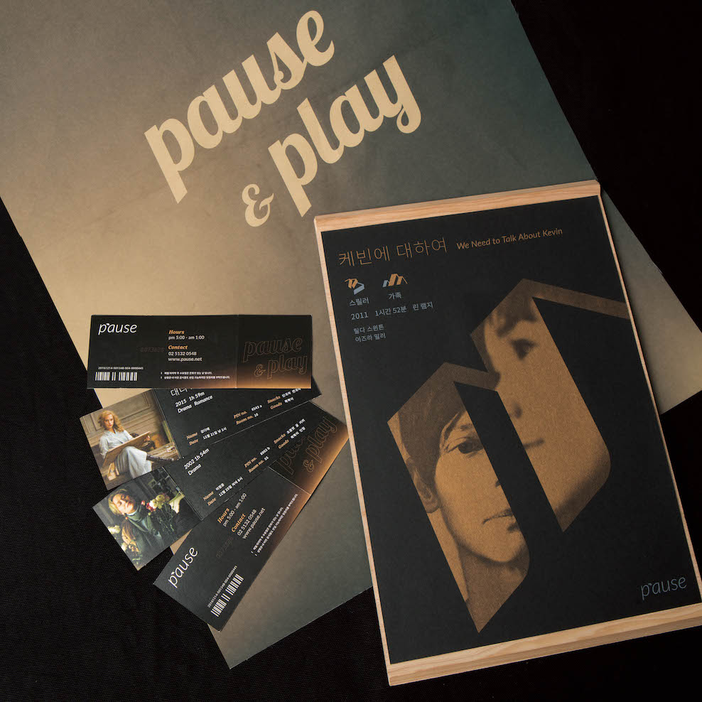
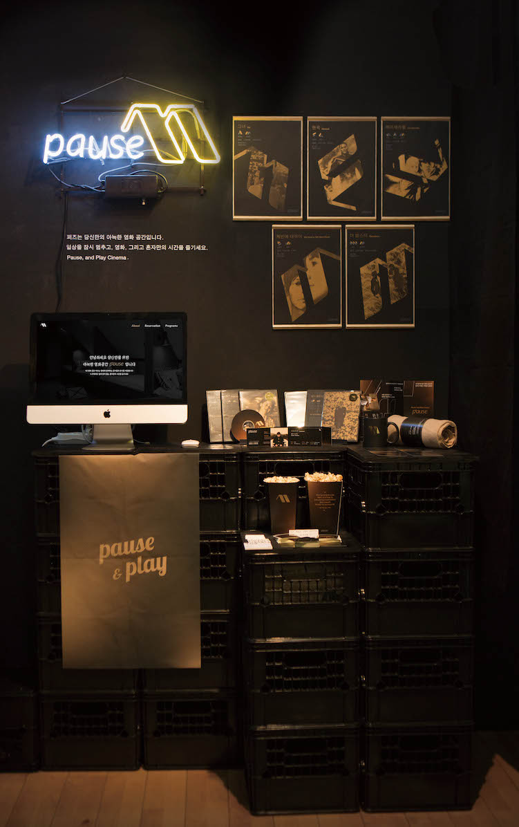
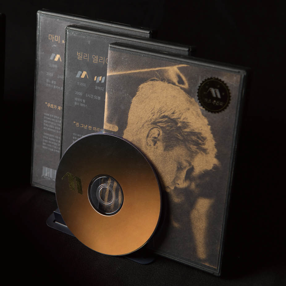
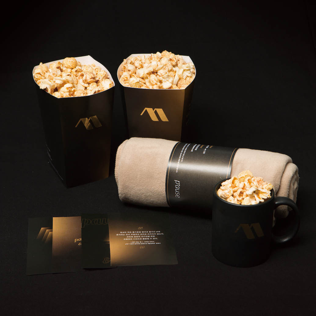
The brand name "Pause" stands for the meaning of the word literally, a time interval. This name imply it gives a pause to routine and time alone with a movie. The graphic motif of Pause was inspired by pause icon and the shape of the roof which means a space. It is used to design logo and various applications of brand. Domestic multiplex cinema uses the red color for pleasant and dynamic mood. However, Pause use low-saturation gold color for delivering warm and comfortable atmosphere on the private theater. The main applications include website, movie posters, DVD with cases, tickets, leaflets and popcorn packages. In addition, mugs and blanket are also designed to make cozy atmosphere on the display. Visiting the website, you will find an introduction of the brand and make a simple reservation.
Website address : https://proj-pause.herokuapp.com/views/intro.html </div>
With rapid increasing of one person households in the city, lifestyle such as ""Eating alone" and "Drinking alone" are not fresh to us. In addition, these kinds of "Cocoon trend" are spreading even in our cultural life. There are popular examples like Norabangs and comics shops for one person. Now many people want to find places to enjoy their leisure and actively use them. This brand design work ""Pause"" is started and developed as one person theater with those trends.
The brand name "Pause" stands for the meaning of the word literally, a time interval. This name imply it gives a pause to routine and time alone with a movie. The graphic motif of Pause was inspired by pause icon and the shape of the roof which means a space. It is used to design logo and various applications of brand. Domestic multiplex cinema uses the red color for pleasant and dynamic mood. However, Pause use low-saturation gold color for delivering warm and comfortable atmosphere on the private theater. The main applications include website, movie posters, DVD with cases, tickets, leaflets and popcorn packages. In addition, mugs and blanket are also designed to make cozy atmosphere on the display. Visiting the website, you will find an introduction of the brand and make a simple reservation.
Website address : https://proj-pause.herokuapp.com/views/intro.html </div>
"일상의 작은 즐거움을 찾아내고 즐기다 보면 '혼자'라는 것이 부정적인 의미로 여겨지지 않는다. 오히려 온전히 자기만을 위한 재충전의 시간으로 활용할 수 있다."
- 사이토 다카시, <혼자 있는="" 시간의="" 힘=""> 중에서.
도시의 1인 가구 급증과 더불어 등장한 ‘혼밥, 혼술’ 등의 생활 방식은 더는 새로운 일이 아니다. 이러한 1인 트렌드는 이제는 먹고 마시는 활동을 넘어서, 1인 노래방이나 만화방 등의 문화 공간까지 자리매김했다. 많은 사람이 혼자만의 여가를 즐길 수 있는 공간을 찾고, 적극적으로 소비한다. ‘퍼즈(Pause)’는 이러한 인사이트에서 출발한 1인 영화관 브랜딩 작업이다.
‘Pause’라는 이름은 일시 정지라는 영문 뜻 그대로, 일상을 잠시 멈추고 영화와 함께 혼자만의 시간을 즐긴다는 의미를 담고 있다. 그래픽 모티프는 일시정지 아이콘과 영화관의 '공간'을 뜻하는 지붕 모양에서 영감을 받아 디자인 했으며, 심볼을 비롯한 다양한 애플리케이션에 활용했다. 기존 국내 멀티플렉스 영화관의 레드 컬러가 즐겁고 역동적인 분위기를 냈다면, 퍼즈의 채도 낮은 골드 컬러는 개인 공간의 따뜻하고 편안한 분위기를 조성한다. 애플리케이션으로는 웹사이트, 영화 포스터, DVD 케이스와 CD, 티켓, 리플렛, 팝콘 패키지, 엽서 등을 디자인 했다. 또, 담요와 머그같은 실제로 영화관 안에서 쓸 수 있는 굿즈를 디자인해, 디스플레이상에서 더 아늑한 분위기를 내도록 했다. 실제 웹에 들어가면 영화관 소개가 나와 있으며, 간단한 예약을 해볼 수 있다.
주소 : https://proj-pause.herokuapp.com/views/intro.html </div>
All rights reserved © 홍익대학교 디자인학부 시각디자인전공 졸업전시회 2016
version.0.0.1 Jerkyll included. Design by JiHoonLee
version.0.0.1 Jerkyll included. Design by JiHoonLee